Through the brand foundation workshop, we evaluated several archetypes against the organization’s mission, personality, and desired market presence. Explorer-family archetypes were close, but most emphasized fearlessness or spontaneity, which were traits that misaligned with the relationship-driven, advisory role the organization needed to embody. Pioneer emerged as the strongest fit because it conveyed purposeful innovation and leadership without recklessness. It positioned the brand as a first-mover guiding businesses toward modern, intelligent building performance.
Archetype
Working in partnership with our external brand agency, I helped guide the internal team through the Brand Foundation workshop, where we clarified the attributes the new brand needed to express in the market. My role was to interpret the agency’s frameworks for our leadership team, facilitate discussion, and synthesize the qualities that consistently emerged: boldness, expertise, strategic clarity, and trustworthiness. These insights shaped the verbal identity of the brand as a voice confident enough to engage executives and collaborative enough to support facilities teams.
Voice & Tone
Several routes were explored, including refining messaging within the existing brand structure. However, these approaches would not fully address how the organization’s value was understood at an executive level. Ultimately, an umbrella brand emerged as the most effective way to unify HVAC and controls under a single forward-facing identity. This structure would allow technical services to be translated into business-level outcomes, enabling executive conversations while continuing to support operational teams responsible for building performance.
Directional Outcome
The organization’s existing brand structure positioned HVAC and controls as technical services rather than strategic business drivers. While the solutions delivered measurable impact, the brand framework offered limited language for communicating outcomes in terms that resonated with executive decision-makers. Through discovery, it became clear that incremental messaging would not resolve the disconnect. This raised a more fundamental question: whether the existing brand structure itself was limiting how value could be understood.
Strategic Need
The people responsible for building outcomes were not the same people responsible for business outcomes, and the brand needed to speak fluently to both.
Key Insight
I conducted internal discovery through interviews with ownership, sales leadership, and the building performance team to identify where communication was breaking down. This research focused on how different audiences interpreted value, risk, revealing misalignment between technical delivery and business-level expectations.
Approach

THE GAP
Challenge
The organization’s services were delivering measurable business impact, but the brand was positioned primarily as a technical HVAC provider. Business leaders defined strategic objectives, yet sales conversations were routinely redirected to facilities teams without decision-making authority. This disconnect prevented the value of whole-building performance from being understood at an executive level.
Collaboration
Worked directly with company ownership and executive leadership, with an external brand agency supporting naming, logo development, and website development.
Timeline
2023 - 2026
Dynamiq is a whole-building performance brand that integrates HVAC, controls, data analytics, and human insights to help organizations improve reliability, efficiency, and modernization. The brand was created to reframe building performance as a strategic driver of business outcomes.


Deliverables
Brand identity system
Messaging architecture
Sales collateral suite
Social media visual identity
Website
Role
Brand Strategy
Messaging
Visual System Development
Digital & Print Applications
Tools
Canva
Adobe InDesign
Adobe Illustrator


Competitor Analysis
Before exploring naming directions, we audited the visual and verbal conventions used across the mechanical services and building technology sector. Most competitors rely on traditional, literal naming and conservative color palettes built around safe industrial hues. Even brands with broader palettes remain rooted in reliability cues rather than innovation.
This revealed an opportunity for a brand that signaled forward motion, intelligence, and strategic value. A direction better aligned with the Pioneer archetype and the outcomes-focus positioning we needed.
Name Exploration
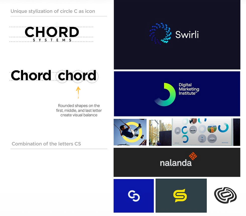

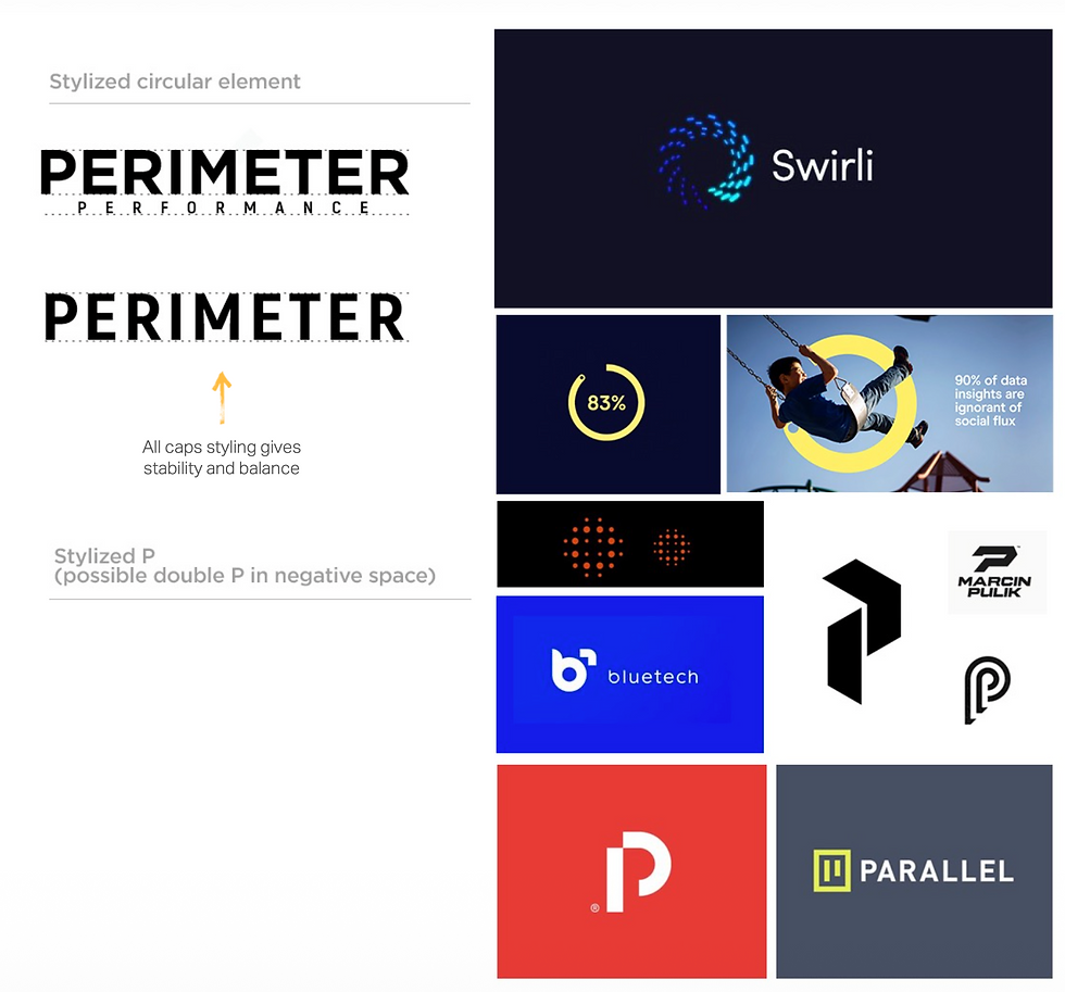
Several naming directions were explored, including concepts that emphasized systems (Chord Systems, Syllogy), reliability (Perimeter Performance) and perspective (Skout360). Each option aligned with aspects of the Pioneer archetype, but none fully captured the brand’s need for forward movement, adaptability, and intelligence.


Naming Rationale
We ultimately selected Dynamiq because it captured the brand’s core purpose: movement, intelligence, and measurable progress. The name blends dynamic (forward motion, adaptability, responsiveness) with IQ (insight, intelligence, analysis), signaling both technological capability and human expertise.

Wordmark & Icon Rationale

1. Forward-Leaning Geometry
The forward-leaning angle of the icon conveys momentum and progress, reinforcing the Pioneer archetype and the brand’s future-focused posture.
3. Clean, Geometric Construction
The wordmark uses controlled geometry and consistent stroke logic to communicate discipline, reliability, and technical precision.
2. Upward Trend
The icon’s ascending strokes form a subtle lowercase “d” while also functioning as an upward-trending bar graph, expressing measurable performance gains enabled by the brand.
4. The “A”
The stylized “A” removes the traditional crossbar, forming a simplified upward arrow. This reinforces direction, guidance, and forward movement while introducing a distinctive typographic detail that differentiates the wordmark.